
Hockey Jersey Mockup: What to Check Before You Approve the Design
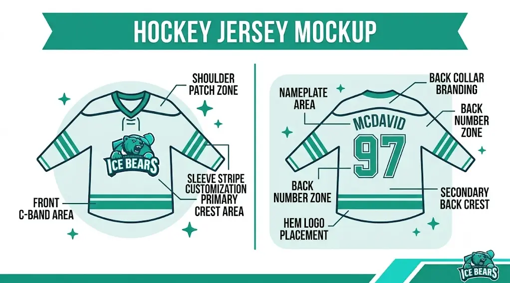
A mockup is the last calm moment before the order becomes real. After approval, a misspelled name, unreadable number, or wrong sleeve detail can turn into a production problem.
Use the proof as a quality-control document, not just a nice preview.
The best review process checks design, roster, sizing, and production details in one pass.
Check the design from rink distance
Start with readability. Back numbers should stand out clearly against the base color and stripe pattern. Sleeve numbers should not disappear into dark panels or busy graphics.
If the jersey looks cluttered when zoomed out, simplify before approving.
Use this quick checklist before moving forward:
- Front crest centered: A small shift can make the whole design feel off.
- Back number readable: Prioritize contrast and scale.
- Name spelling correct: Check letter by letter.
- Sleeve numbers visible: Make side identification easy.
- C/A letters placed correctly: Keep them clear on the front chest.
- Sock colors match: Confirm them with the jersey palette.
Review every roster detail
Names and numbers are the easiest mistakes to miss because everyone thinks someone else checked them. Compare the proof against the roster sheet line by line.
Do not approve based on memory.
Look at player and goalie versions
If the order includes a goalie cut, ask to see it represented. A goalie jersey may need different sleeve and body proportions.
Also confirm whether youth and adult sizes use the same layout scaling.
Confirm production assumptions
Ask whether colors may shift slightly on fabric, whether changes are allowed after approval, and how long production starts after sign-off.
Those answers help prevent unrealistic expectations.
Review the proof in the order players will see it
Start with the front crest, then the back number, then sleeves, shoulders, and socks. That sequence follows the most visible parts of the uniform.
Do not spend ten minutes debating a tiny trim line while the back numbers are hard to read.
Confirm color contrast, not just color preference
A favorite color combination can still fail if it lacks contrast. Red on black, navy on royal, and thin gray outlines can all become muddy from distance.
The mockup should make names and numbers easy to identify quickly.
Have a Look at Our Exclusively Designed Hockey Uniforms Through Sublimation.
Use the proof to catch production assumptions
Ask whether the proof shows all sizes, whether goalie cuts are represented, and whether colors may vary slightly on fabric.
A clear approval process protects both the team and the supplier.
Details worth verifying before you order
This is where a generic article usually stays vague. A real team buyer should check the operational details that affect price, timing, fit, and whether the finished jersey matches the proof.
Use these checks to turn the article advice into a cleaner purchase:
- Artwork check: Is the logo crisp?. Before approval, use this as a real order checkpoint: edges look clean.
- Numbers check: Can you read them quickly?. Before approval, use this as a real order checkpoint: contrast is strong.
- Roster check: Do names/numbers match the sheet?. Before approval, use this as a real order checkpoint: every line checked.
- Production check: Are changes still allowed?. Before approval, use this as a real order checkpoint: rules are clear.
Common mistakes to avoid
Most design mistakes come from approving the first good-looking preview instead of checking whether the design can survive production and rink-distance viewing.
- Overcrowding the layout: Too many logos, outlines, and stripes reduce readability.
- Approving without roster review: Spelling and number errors are easier to catch before production.
- Forgetting scale: Youth sizes and goalie cuts may need layout adjustments.
- Trusting screen color too much: Colors can shift on fabric, so contrast matters more than monitor perfection.
A practical design workflow
Start with a clean concept, then turn it into a proof that can be checked. The team should approve colors, crest, number style, roster data, and production timing in that order.
Before final approval, compare the proof with the roster line by line. The design is not truly finished until the production details match the people wearing it.
Mockup Approval Checklist
| Area | Question to ask | Approve only if |
| Artwork | Is the logo crisp? | Edges look clean |
| Numbers | Can you read them quickly? | Contrast is strong |
| Roster | Do names/numbers match the sheet? | Every line checked |
| Production | Are changes still allowed? | Rules are clear |
Pro tip: Print the roster or open it beside the proof. Switching between tabs is how small spelling errors survive.
Conclusion
A proof is more than a preview. It should catch readability, roster, sizing, and production issues before the order is approved. Slow review saves faster fixes later. Use it as the final checkpoint before approving a custom order.
FAQs
Is a custom proof usually free?
Many suppliers offer a free proof or preview, though custom artwork services can have separate fees.
What should I check on a jersey proof?
Check colors, logos, number contrast, spelling, sizes, C/A letters, socks, and goalie versions.
Can a mockup show final fabric color exactly?
It is a close guide, but screen colors and fabric colors can differ slightly.